
In October of 2018, I was asked to interview for a position: Professor of Conservation, Sustainability, & GIS for a university in Virginia. I am only halfway through my PhD; under the best circumstances, I can hope to submit two or three chapters of my dissertation in the next calendar year. Defending one’s doctorate and completing a postdoc (or two) is all-but mandatory for faculty positions these days, even non-tenure track teaching professorships…so this position was assuredly out of my reach.
Because I had such negligible chances of succeeding, I threw caution to the wind and decided to give the teaching lecture that I wish I’d received as an undergraduate, and that I’d always wanted to give as a graduate student.

Observation, induction, deduction, calculation, interpolation–these are operations that students should adore.
Instead, early-stage ecologists believe their program of study is a simulacrum of that moment in elementary school where they’re standing at the blackboard expected to solve a math problem, petrified that they will be wrong.
Science is not about proving yourself right; science is about becoming right. It’s about tacking towards the truth with all the tools at your disposal, correcting course when your peers help indicate your errors, and trusting that the winds of curiosity will push you towards genuine insight.
So I created a lecture that took research from the department for which I was interviewing, and converted it into clear, accessible visuals that spoke to the process of exploring and analyzing data. I began with talking about sturgeon, which many of the faculty and students knew threw the university’s involvement with reintroduction efforts.

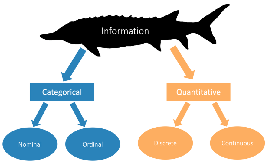
Sturgeon are strange, beautiful, distinctive animals. They have been roaming the planet’s waterways since the Triassic, having seemingly found their evolutionary stride. While there is something unmistakably sturgeonly about each species, all have small details that naturally draw the eye to allow for quick distinction: head shape, fin proportions, etc. These things are easily stylized, as in this Dabry’s Sturgeon illustration. Note its pointy nose and nearly-pyramidal dorsal scales (above).
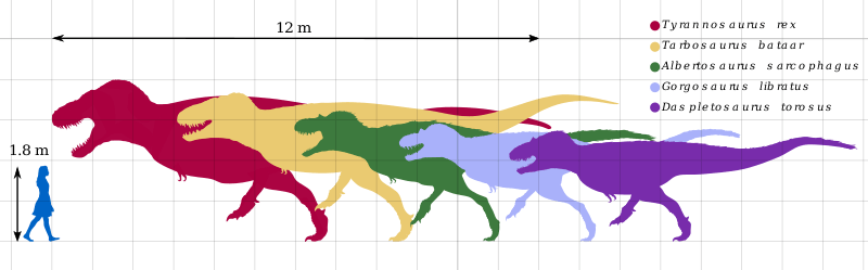
While creating the sturgeon images for my talk, I drew inspiration from the dinosaur figure (above) which layers silhouettes with contrasting colors. Critically, Mr. Recini placed the skulls of each species in proximity and alignment, allowing viewers to quickly contrast subtle differences in shape that are critical to distinguishing species independent of size.
I strove to have my sturgeon (in the figures below) mimic Recini’s techniques. To do so, I consulted and collaborated with my sibling, Renee Albrecht-Mallinger.
|
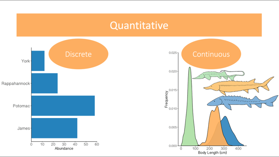
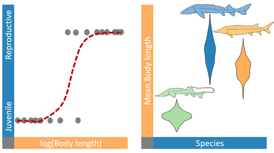
Representations of quantitative, categorical, and the combination of continuous and categorical data.
|
Image credit, both figures: © Dan Albrecht-Malinger, 2018
|
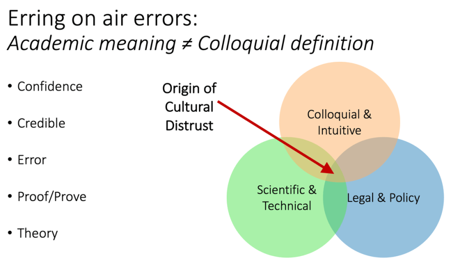
From the sturgeon example, I moved into how and why we care about central tendency and variation when we explore the world around us. Lastly, I asked my audience to reflect on when they had felt alienated by science terminology, or when people around them had expressed distrust of science. I presented this as an inevitable cultural conflict, but one that scientists of all levels could help resolve.
Turns out, giving a lecture you truly care about can turn heads: I will be starting as a professor of Environmental Studies at that university in January. I would not have given such an effective talk without the design components and skills we practiced in Visualizing Science. The application of simple, color-blind-accessible schemes & the reinforcement of concepts using multiple modalities (color, scale, shape, etc.) was critical to conveying my message to my audience of professors and graduate students
