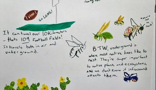

This is the first image I created for this class, and it remains my favorite. I wanted to make a stand alone image that people could read and understand, without a science background and without me standing next to them and defining every single image and term.
|
One of the #MSPaintYourScience posts on Twitter which inspired my own visualization. Credit: screenshot of a tweet by Christine Bell (@khrysdie)
One of the #MSPaintYourScience posts on Twitter which inspired my own visualization. Credit: screenshot of a tweet by Rebecca Groom (@palaeoplushies)
|
One of the #SketchYourScience posts on Twitter which inspired my own visualization. Credit: screenshot of a tweet by Lisa August-Schmidt (@myrkurljos)
|
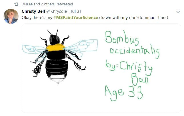
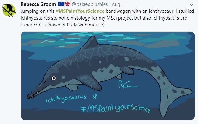
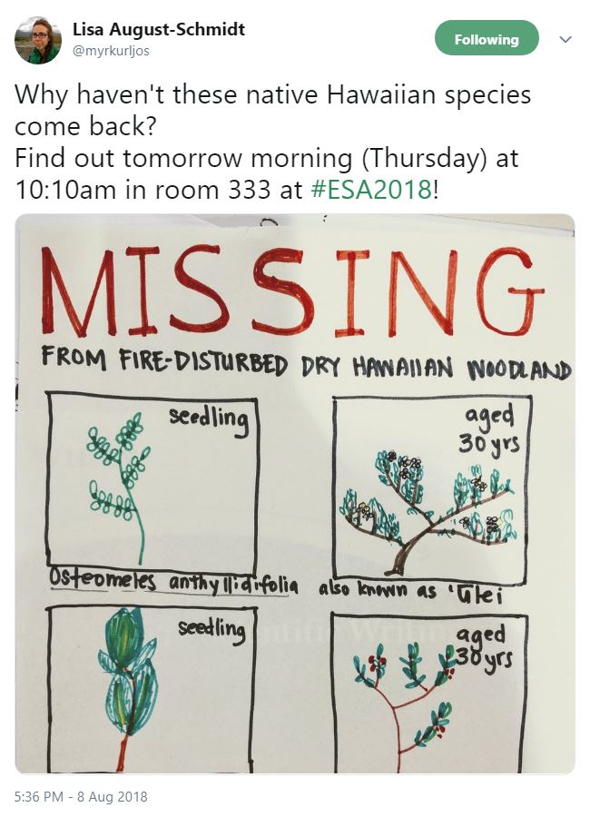
As much as I loved looking at the other images people had made in Twitter posts about #SketchYourScience and #MSPaintYourScience, many of them did not really explain the research in a way that was immediately accessible. I needed to read the person’s tweet to know what their research project was, or in some cases I couldn’t tell at all.
In my own image, the text and images are staggered — I intended it to read left to right, top to bottom. Looking at it now, I think it would have worked better to include some arrows, or to frame each image and arrange them like a comic strip. I used simple, largely 2-dimensional images. I don’t think photorealism is necessary to understand a scientific concept or to make an appealing image. In fact, given that my work involves insects, a subject many find unappealing, extremely realistic images might actually dissuade some people from reading further.

If I were to continue working on this image, I would definitely try to make the organization better by using frames or arrows. I might also limit the color palette slightly – I would rather have this image in color, but I think it might look cleaner if I limited myself to three or four colors. I did not leave myself room to put a title for the image on the poster itself, a definite oversight on my part. I think the text is reasonably legible, but there are a few places where letters are colliding. I would try to make something where the text was readable from a greater distance. I would also try making a fully digital version, using Inkscape to draw the images and then arranging and adding text in Canva.
What I like best about my image is its simplicity. The visuals are minimal cartoons, the text is in a casual, conversational tone, and it isn’t excessively crowded. In short, what’s appealing about it is everything that makes it different from other scientific images I’ve produced.

When I’ve made posters and presentations for classes and conferences, I tend to create massive, ugly blocks of text and multiple photos and graphs crammed together. I clutter everything with scientific jargon and talk at auctioneer speed when I try to explain myself. This is obviously terrible, and it makes my research unappealing to other scientists and inaccessible to non-scientists.
Since starting this class I have been thinking more about the choices I make when I talk, write, or make visual representations of science. In my desperation to prove that what I’m doing is valid and that I actually understand this stuff, I make it harder for other people to understand me. I’m hoping the lessons about design and communication I am learning in this class will help me to make my science and general scientific topics something everyone can see and appreciate, no matter what my audience looks like or what my topic is.
