

Or, to put it a different way: how can GPS-collars contribute to effective conservation and management decisions?
That’s the question I’m trying to answer by letting the reader actually see and interact with the story. I’d like to have a “show don’t tell” approach to let the reader piece the information together into a story. Right now though, the story is still static.
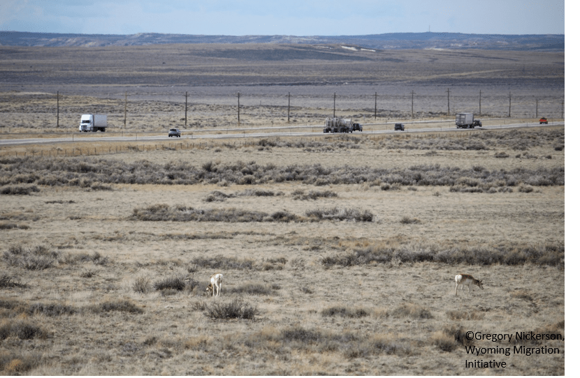
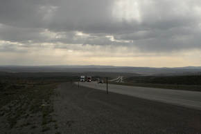
Given the goal, the target audience is people who already have some understanding of GPS-collar studies and wildlife management. I would like to expand the target audience more to the general public of Wyoming. That is why I started the visual with an image of Interstate-80: a view anyone from Wyoming should be familiar with.
|
Interstate 80, photo by Greg Nickerson ©2018
|
Interstate 80, photo by Benjamin Robb ©2018
|
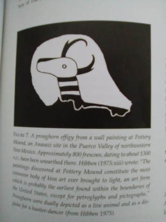
References for this visual also include this Anasazi pictograph. At first, I included the pictograph because I thought it was something I could draw (note: I cannot). Despite the Anasazi having nothing to do with Wyoming, I really like the contrast between the Interstate and the pictograph.
Modernity and history.
The framework for my visualization is this visual essay. I like this framework of moving vertically through the story with two columns, it’s intuitive, pulls you in and encourages you to read the full story.
This is just scratching the surface of where I want this visualization to go. I want to actually show movement. Two GoogleEarth images next to each other (see locations labeled 1 and 2 on the concept sketch above) hardly compares to actual movement. Additionally, I don’t like how those two images are left-to-right. I’d rather keep all visuals moving up-down. It disturbs the flow of the visual to go from down to right to left-and-down for each picture. I also need to think about background; pictures on a white surface are hardly pleasing to look at.
So I’ll brew up the next cup of coffee, and keep rolling. There’s still a lot I need to do to improve!

