

I made this figure (Fig.1) for a scientific publication or to accompany a scientific talk. My main objective with this figure was to condense observational data collected underwater during an unusual feeding frenzy event in Lake Tanganyika, East Africa.
This figure was generated using the package Alluvial (Bojanowski and Edwards 2016) in R, version 3.4.2 (R Core Team 2013).
To generate this figure, I searched “plot types in r” on google images and at first something called a “chord diagram” struck me as an attractive way to represent various categorical variables. However, after some trouble-shooting, I realized that this was not appropriate for my kind of data.
In Illustrator, one can double-check for this under View> Proof Setup> Color Blindness Protanopia-type or Deuteranopia-type. After this, I added little cartoon-like figures of the fishes concerned and wrote a detailed legend for the reader.
The following three figures inspired my data visualization:
|
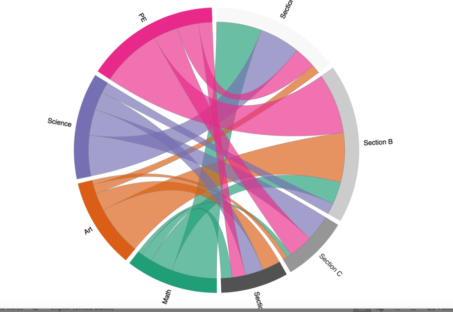
Chord diagram developed by Fisseha Berhane
|
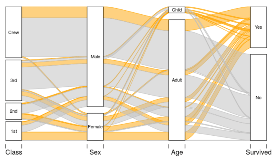
lluvial diagram of the Titanic data set, from Michal Bojanowski’s tutorial.
|
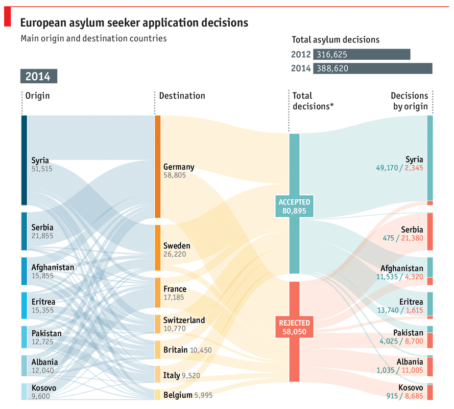
Alluvial plot representing asylum seeker application decisions in Europe, created by The Economist using Eurostat as source.
|
If I continued working on the data visualization, I would like to make it more attractive and also improve its readability.
References
- Bojanowski M and Edwards R. 2016. Alluvial: R Package for Creating Alluvial Diagrams. R package version: 0.1-2, URL: https://github.com/mbojan/alluvial>.
- R Core Team. 2014. R: A language and environment for statistical computing. R Foundation for Statistical Computing, Vienna, Austria. URL http://www.R-project.org/.
