
I signed up to take Visualizing Science, initially, so that I could improve my animation skills as well as develop my slide design more for my thesis defense.
However, shortly after beginning the class, I realized that my science isn’t easy to comprehend for those who are not reproductive endocrinologists. This realization made me shift goals a bit. Instead of making my complex data look good I now wanted to make my complex data look simple (and good).
|
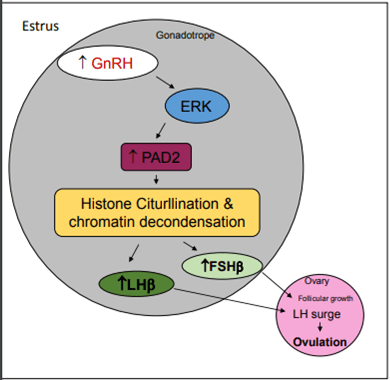
Moving toward a more approachable visual of my research. Credit: © Jessica Berg, 2018
|
This poster was created by my friend. I really like the layered effect of this poster Credit: © Darby Clark
|


With this change in audience came a change in design and delivery. I removed many of the jargony words and added simplified structures. Instead of saying “gonadotropes within the pituitary” I just added a picture of where the pituitary is and zoomed in on the cells within that gland. This is what I came up with:
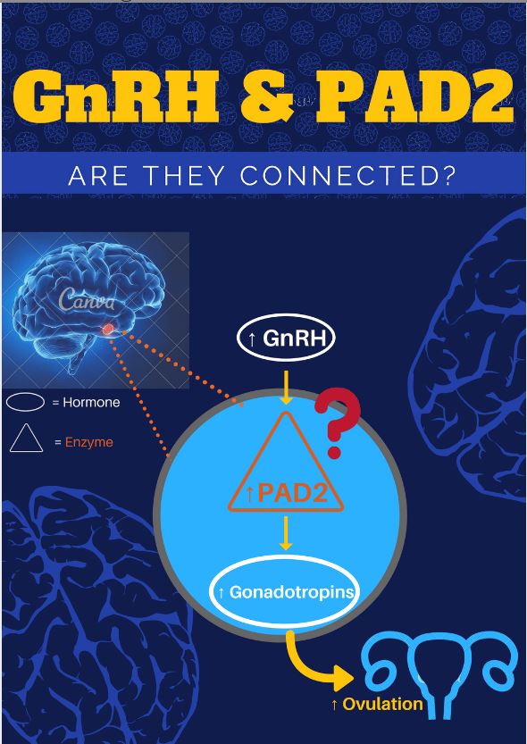
I also tried to use identifiable structures within the body like the brain and the basic structure of the female reproductive tract so that people wouldn’t get lost before they even began looking at my design.
Additionally, I added a backdrop of the brain to emphasize that the brain is the location of much of my research.
With the design I also tried to limit my use of color so that when there was a drastic change in color it emphasized a point. An example of this is when I added a question mark in red to highlight the focus of my research.
As I keep working on this I’d like to simplify the brain diagram so that it is more similar to the female reproductive tract. I also think a more compelling/less sciency title might play to my advantage in attracting people with non-science interests to my research.
Overall, I really enjoyed the progression of this project and found that the process really helped me to solidify, in my own mind, the most important points of my research.
